Mobile performance
Mobile Website Speed Checklist for Small Businesses
Find practical mobile website speed improvements: test real customer journeys, prioritise images, reduce unnecessary scripts and prevent layout shifts.
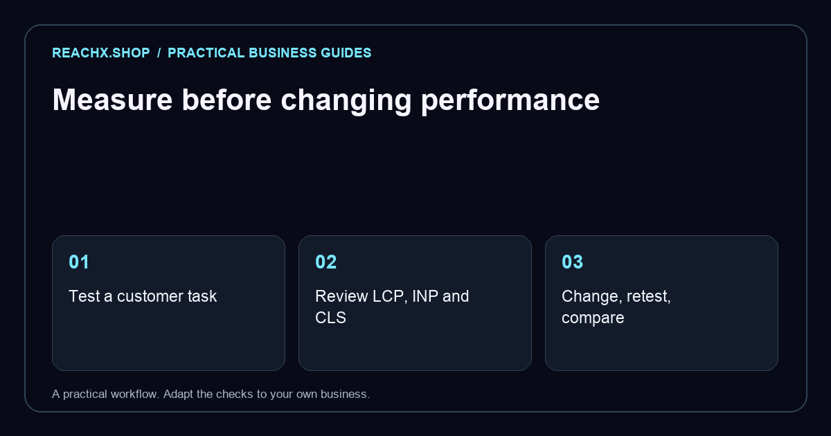
Test a real customer task
Choose a page and a task that matters, such as opening a service page and submitting an enquiry. Test on a phone using mobile data as well as Wi-Fi. Note what happens before the page feels useful: a blank screen, a moving button or an unresponsive menu. Keep the device, connection and test date in your notes. A single fast office computer is a poor substitute for the conditions your customers experience.
Understand the measurements
Core Web Vitals describe loading, responsiveness and visual stability through LCP, INP and CLS. Google’s Web Vitals documentation explains these metrics and their thresholds. Use PageSpeed Insights to identify issues, while distinguishing a controlled laboratory test from field data collected from real visits. A small site may not have sufficient field data. Treat a score as a diagnostic signal and verify that the customer task actually becomes easier after a change.
Prioritise the first screen
Start with the largest visible content and the resources needed to display it. If a large banner dominates the first screen, check its file size and whether the phone downloads an unnecessarily large version. Provide appropriately sized images and avoid shipping desktop-sized photography by default. Keep essential copy readable while assets arrive. Discuss priorities with your developer before adding preloads everywhere; competing high-priority downloads can make the important resource harder to identify.
Load images at the right time
Images farther down the page can often use native lazy loading. Keep the important first-screen image available immediately rather than delaying it. Set image dimensions so the browser can reserve space. These recommendations are covered in web.dev’s image loading guide. After changes, scroll through the page on a phone and check galleries, hidden slides and product cards. An optimisation is unsuccessful if it leaves useful content missing when a shopper needs it.
Review scripts and moving layouts
List optional widgets, chat tools, tracking integrations and visual effects. Give each an owner and a clear business purpose. Remove unused integrations carefully, then test the flows they previously supported. Look for banners, font changes or embeds that push buttons away as the page loads. Reserve space for predictable components. Avoid judging performance only by the homepage: a booking form or product detail page may have a completely different set of resources.
Make one change and retest
Keep a small change log: problem, proposed fix, test conditions and result. Repeat the same task after each meaningful change, then check another representative page for regressions. Also test keyboard access and reduced-motion settings when changing interactions. Speed work should preserve the functions customers need. For a prioritised review, request a website and SEO audit or explore our technical SEO service. A useful outcome is a working, comfortable mobile journey, not merely a higher score.